Industrial and e.g. HR Application Examples (Non-industrial examples, such as HR, are located below the industrial example block.):
Industrial Example:
The Meaning and Usefulness of Correlation (Exploratory Data Analysis – EDA) in Searching for Industrial Relationships:
Exploratory Data Analysis (EDA) aims to visualize, understand, and draw preliminary conclusions from data without predefined hypotheses. During EDA, we explore data patterns, trends, and potential relationships.
In focus with correlation analysis
Correlation analysis is a key tool in EDA that determines whether there is a relationship between two or more variables. Correlation indicates the strength and direction of a relationship: it can be positive (both variables increase together), negative (one increases as the other decreases), or absent (the variables are independent).
The Role of Correlation Analysis in EDA: Unveiling Relationships Between Data:
During EDA, correlation helps reveal how variables influence each other. For example, in a manufacturing database, examining the relationship between machine temperature and product quality can help determine whether high temperatures lead to poor quality.
Detecting Trends and Patterns:
Correlation analysis can uncover trends and patterns. If two variables strongly correlate, they may move together, indicating a shared effect or cause.
Recognizing Multicollinearity:
Multicollinearity occurs when two or more independent variables strongly correlate. This can pose challenges in regression modeling, as it may distort results. Correlation analysis in EDA helps identify such issues.
Laying the Foundation for Further Analysis:
Correlation aids in the initial understanding of data and lays the groundwork for further analysis, such as regression modeling, where the goal might be to predict one variable based on others.
Data Cleaning:
Correlation analysis can also assist in data cleaning. If two variables strongly correlate, removing one from further analysis may reduce redundancy and complexity.
Practical Example:
Suppose we are working with production data from a manufacturing plant and want to identify factors that most influence product quality. During EDA, we examine the correlation between different variables, such as:
Temperature vs. Product Quality
Pressure vs. Product Quality
Speed vs. Product Quality
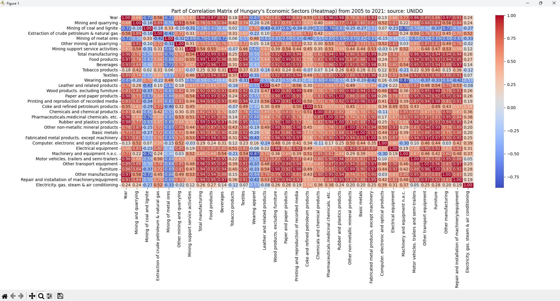
A correlation matrix and visualizations (e.g., heatmaps) can quickly highlight the most significant factors to consider for optimizing production.
Correlation analysis in EDA is a powerful tool for uncovering relationships in data, detecting anomalies, and preparing for deeper analysis. Properly conducted correlation analysis can provide a solid foundation for predictive models and other statistical analyses.
HR Example:
1. Training Programs and Performance Improvement:
Correlation analysis can determine whether employee performance improves after participating in various training programs. For example, it can examine the correlation between training hours and annual performance evaluation results. A positive correlation suggests that training contributes to improved performance, making it worthwhile to offer additional training.
2. Workplace Atmosphere and Sick Leave:
The relationship between workplace atmosphere (e.g., relationships with colleagues) and sick leave data can also be analyzed. A strong correlation between negative workplace relationships and frequent sick leave could indicate the need to improve the workplace environment through team-building activities or conflict resolution training.
Correlation Heatmap of Hungary's Economic Sectors (Collapsible Content – Click the + Icon on the Right):
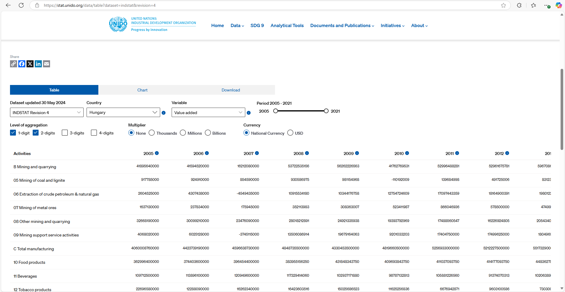
Based on data from the UNIDO website, the correlation matrix shows the relationships between the output values of Hungary's economic sectors. A "heatmap" provides an excellent basis for identifying basic relationships in exploratory data analysis (EDA). However, we must understand the concept of correlation and apply critical thinking! The chart has a flaw: time – years do not correlate with anything (despite the chart showing different values), as time was the variable along which the data was collected. This is why it is indicated in the matrix.
A correlation heatmap is one of the best tools in Exploratory Data Analysis (EDA) for visualizing relationships.
Correlation and Critical Thinking (Collapsible Content – Click the + Icon on the Right):
Correlation measures the strength and direction of the relationship between two or more variables. Mathematically, it shows how one variable changes with another. The most common form is linear correlation, where the relationship between variables can be represented by a straight line.
The correlation coefficient (usually denoted as r) expresses the strength and direction of the relationship:
r = +1: Perfect positive correlation (both variables increase together). r = -1: Perfect negative correlation (one increases as the other decreases). r = 0: No linear correlation (no obvious relationship between the variables). Pearson's correlation coefficient is the most commonly used, but there are other types, such as Spearman rank correlation.
Why is Critical Thinking Important When Interpreting Correlation?
While correlation is a valuable tool for studying relationships between variables, it’s essential to interpret it critically because the results can be misleading for several reasons:
Correlation Does Not Imply Causation: Correlation does not mean that one variable causes the other. Two variables may correlate closely without a causal relationship. For example, research shows a correlation between frozen food consumption and divorce rates, but this does not imply a causal link.
Third Variable (Confounding Factor): Sometimes the relationship between two variables arises due to a third variable. For example, there might be a positive correlation between ice cream sales and sunburn, but the actual relationship is likely due to summer weather (the confounding factor), which drives both activities.
Correlation Traps: The value of the correlation coefficient can be misleading if we don’t understand the context. For instance, a non-linear relationship may not show up well with Pearson’s coefficient, even if a strong connection exists.
Sample Size: Small sample sizes can distort the correlation coefficient and fail to reflect the true relationship in the entire population. Ensuring a sufficiently large sample size is crucial for statistical validity.
Effect of Outliers: Extreme values (outliers) can significantly impact the correlation coefficient, as Pearson’s correlation is sensitive to them. A few outliers can increase variance and skew the correlation.
Summary: Correlation is a valuable tool for exploring relationships between variables, but it is crucial to understand that correlation does not imply causation. Correlation analyses should always be interpreted critically, considering possible confounding factors, sample size, and data type.
Code Snippet: (Expandable content – click the + icon on the right.)
import pandas as pd
import seaborn as sns
import matplotlib.pyplot as plt# CSV fájl beolvasása (cseréld ki a fájl elérési útját)
file_path = r'C:\\Users\\Akos\\Desktop\\Python\\UNIDO_MO_Gazdasága\\Mo_gazdasaga_korrelacio_csv_01.csv' # A fájl elérési útja
data = pd.read_csv(file_path)
# Korrelációs mátrix kiszámítása
corr_matrix = data.corr()
# Heatmap készítése
plt.figure(figsize=(16, 12))
sns.heatmap(corr_matrix, annot=True, cmap='coolwarm', fmt='.2f', linewidths=0.5)
plt.title("Part of Correlation Matrix of Hungary's Economic Sectors (Heatmap) from 2005 to 2021: source: UNIDO")
plt.subplots_adjust(top=0.97)
plt.subplots_adjust(bottom=0.36)
plt.subplots_adjust(left=0.215, right=1.0)
plt.show()
Data source:


